Matteo Moretti is a designer and co-founder of Sheldon.studio, a design company based in Bolzano, but honestly this description may sound a little underestimating when you start exploring his works and his career, which began in the online, motion graphic and data visualisation industry at Erazero Milan. Then in 2010 he started an academic career as a lecturer and researcher on visual journalism at the University of Bolzano and, after ending his experience as a researcher, at the beginning of 2020 he co-founded Sheldon.studio, a name inspired by Sheldon Cooper, a character of the TV series The Big Bang Theory.
As Matteo writes on Linkedin, his work consists of combining social design with data: to get an idea about what it means you can have a look at the People’s Republic of Bolzano, an award winning visual journalism project aimed to contrast biases and misinformation about Chinese migration in Bolzano. “We want to make data, including so called open data, genuinely accessible to users – Matteo explains – as we believe that after making it formally open, it needs to be translated in a way that a broader number of people can read it. Design has the possibility and the responsibility to make data understandable.”
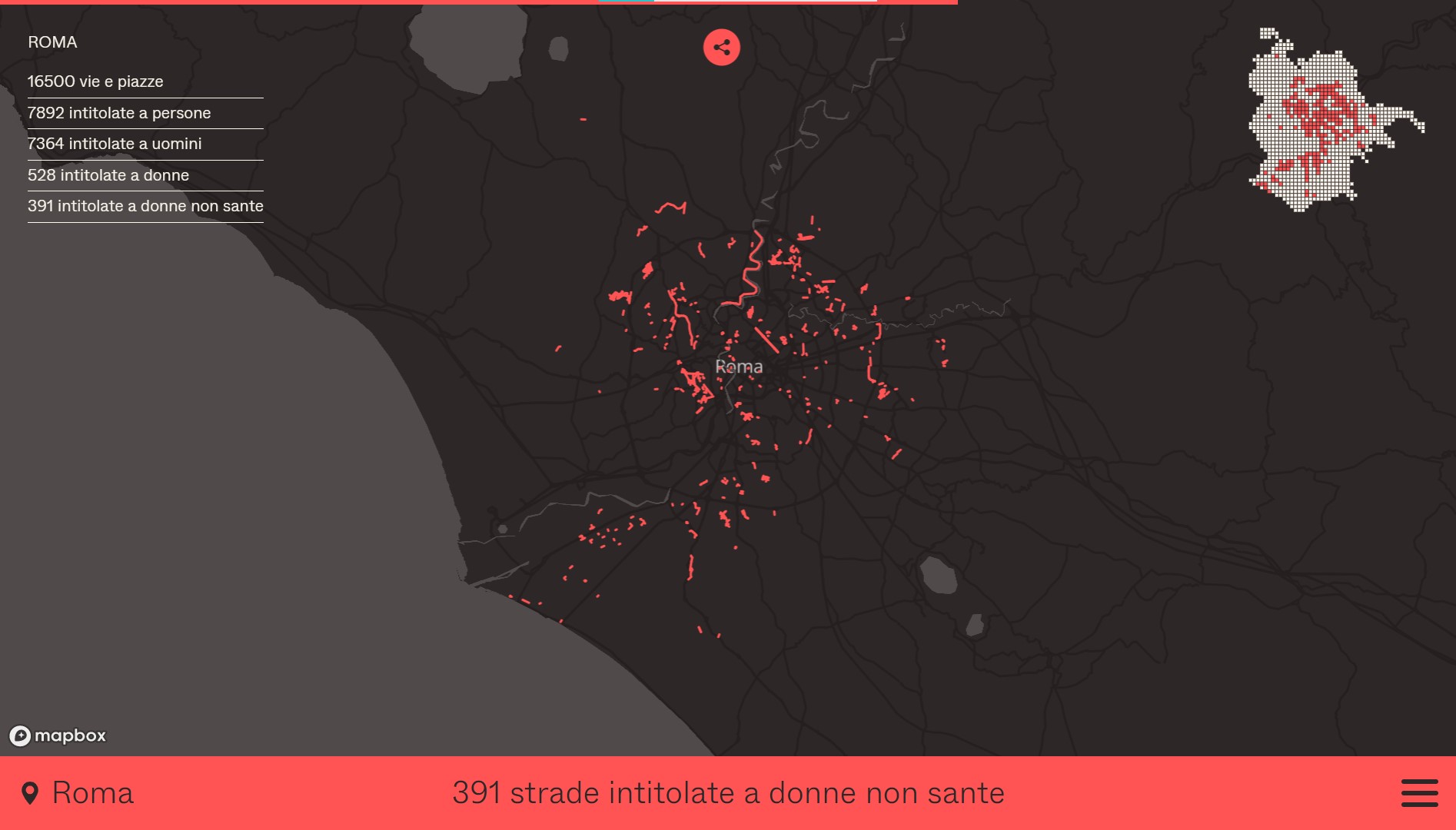
In the wake of this view, Sheldon.Studio together with OBC Transeuropa and EDJNet has recently published Mapping Diversity, a visual project that shows how many streets of the main 21 Italian cities are named for women. Matteo, would you like to tell us more about it?
“As for other of our works, the aim of Mapping Diversity is breaking the bubble. In this case more than one actually. As Sheldon.studio is a EDJNet’s partner, we have been asked to seek a way to tell data they were gathering using Open Street Map and Wikipedia to map place names and check how many of them were dedicated to women. Our design aims to make people – outside the open data, the design or the feminist bubbles – talking about the fact that only a minority of streets – 1,626 out of 24,572 dedicated to a person – in the main Italian cities is named for female personalities. We chose to use scrollytelling with the intent to make people focus on a specific content, such as the number of the streets named for women in your own city.”
This is an example of what you call “informative experience”, I guess.
“Yes, with this concept we mean the union of information and user experience. Users not only read the content, but they can interact with it, living a more engaging experience. Even though we often say that today the average attention threshold is about 5 seconds, we often spend hours peering at social networks, for instance.This happen partly because of specific strategies that catch our attention and keep us surfing for longer than we have planned. Specifically, with Mapping Diversity we want to overcome traditional mapping to show the most important piece of information before letting the user freely explore the content.”
It’s an interesting approach. Could you explain to us which are the other main features that drive your work?
“Sure. Nowadays, more than 90% of users access content by mobile. That’s why we usually start developing the mobile version, then we enrich it to create the desktop version and other possible formats. In addition, as I worked as a researcher at the University in Bolzano, when we started the company we decided we wanted to fill the gap between academy and business: so we try to combine some elements of the scientific method with design strategies and then we assess their impact, to understand which work better according to specific goals.”
Could you tell us an example of this strategy?
“When working on the Glocal Climate Change project we add the possibility for users to share thumbnails that contain information about climate change in their favourite places, such as their hometown or the city where they live. This sharing is a way to bring and hopefully open the debate in your own bubble about this topic. Under our point of view, we tested this as a way both to spread information and discussion about climate change and to promote our work. Moving from the results of this assessment, we redesign some features of our new project, Mapping Diversity, and we will assess them again at the end of the process. In this case the aim is fostering the debate about the dominant gender perspective in our society, but also we want to gather new information about the cities we have already mapped – it’s possible that in some cases data is not complete -, to add new details about data we already have and also to extend the mapping to other cities thanks to users crowdsourcing. Definitely, what we want is to design common goods, more than simple news products. It costs more time and work, but you are building something intended to last, making it an available resource for our society.”
A common question during training about data visualisation is how to improve the graphic literacy or graphicacy. Would you like to give some tips about it?
“I think the main point is not just design a chart, but first of all to understand which is the right representation for our data and its limits. The latters are extremely important as it’s not true that data doesn’t lie. Just think about data on Covid-19 contagion: they surely have helped us to overcome the emergency, but we have had many questions to ask about the ways it has been collected, represented and its limits. For people that would like to enhance their graphicacy and statistic skills there are a bunch of good books that can help to build a correct mindset to read and visualise data, such as How to lie with statistics by Darrell Huff, How charts lie by Alberto Cairo or Data visualisation – A handbook for data driven design by Andy Kirk. If we add that today we have powerful tools such as Flourish, it’s almost hard to create an ugly chart. But it’s fundamental to bear in mind that you need a good level of competence about the topic you are handling to make that chart an open door for your readers. Through it they can start exploring a subject.”
How do you see the data visualisation landscape in Italy today?
“At one hand, we have one of the most important design schools, Density Design, which trains lots of great designers that work in Italy and abroad. On the other hand, we still don’t have a developed culture of data. Talking about trends in the field, I think that data visualisation needs interdisciplinarity at its roots and in this sense I hope that the time of ‘aesthetic’ data visualisation is over. We can’t overdesign and forget to show details that need the visualisation to be displayed: make data understandable is our first task! After a natural period dedicated to exploring different options, now it’s time to look for a more effective balance between clarity and beauty. Honestly, it will always be a changing balance, I guess, as technologies and uses always change but our task is to care about the quality both the information and visualisation. As the same, I think that it’s time to abandon the idea of ‘data neutrality’. Nothing is neutral and data is a way to be part of a public and political debate. Honestly this is the main aim we have when founding Sheldon-studio: to help improve, at least a little, our society through our design projects. In this sense, it’s also important to use data to reflect on our bias, to make them less unconscious and make ourselves more aware about the topic and the related issues we are discussing.”